Press

Three quick ways you can speed up your website

Speed kills!

Lack of speed when it comes to websites. No-one wants to hang around waiting for a slow website to load. It is incredibly frustrating and most people do not have the time or patience to wait. Research shows anything over 1 second load time will affect conversion rates of your website. In fact, every tenth of a second over a 2 second load time bleeds customers. Numbers vary depending on who you believe, but it is several percent of your website users for every tenth of a second.

Going faster

So we have a clear need-for-speed, but how can you achieve a faster website? There are dozens of little detailed improvements to make to fully optimise a site, but follow these three big ones and you’ll make huge progress.

  1. Good Hosting
  2. Optimise Images
  3. Turn on Caching

1. Good hosting

The crux of this is that website hosts are not made equal. A web host is, fundamentally, a computer connected to the internet. Web hosting computers have specialist software to do the job, but many of the things you might intuit about them as computers are true. Namely, these computers will perform better if:

  • there’s better the hardware in the computer
  • it has less simultaneous tasks to do
  • and it has an amazing internet connection

Web hosting companies will often promise you lots of storage, email, and other bells and whistles, such as unmetered bandwidth or several database installations. In fact it is likely these will be the features they tout most. However, none of these things affect your website performance. You probably don’t even need most of them. What matters is the expenditure the hosts expenditure on their hardware, and how many other clients are sharing that particular hardware with your website. Comparing this can be hard as many companies are cagey about it, rough rule of thumb though; the cheapest packages are nearly always terrible.

2. Image optimisation

Images are a super important part of your website presentation and message. They are also the bulk of the “data payload” on most websites. A customer using your website has to download all the images to their device. So how are your images “unoptimised”? The most common issues, images are…

  • larger than they need to be
  • the wrong format for the content
  • not set to most relevant quality

How to fix these issues?

  • Check the dimensions of your images.
    Don’t make pictures larger in pixel width and height than they are going to be seen on the website.
  • Set the right formats.
    Photos should be JPGs and graphics should generally be PNGs. There are new and exciting formats like WEBP, but these are a little harder for non-technical website administrators to use.
  • Set JPG qualities to around 50%.
    It sounds harsh, but this is probably the best balance between performance and visual quality.

3. Turn on Caching

So most websites with content management or page builders are “dynamic”. Not dynamic in the marketing buzzword sense but rather the content the public sees is constructed on request. This is clever stuff, and allows for things like frequently updated blogs and whatnot without having to manually rebuild web pages constantly. However, if your website is building the page every time for every user, it can get a little redundant as it “dynamically” rebuilds the same page over and over. Most of us arent updating our websites that often, and instead we can get your web server to store the last dynamically constructed page for quick and easy display to the next visitor. That’s caching; storing a recent version of something for better performance.

The nuts and bolts of caching is complicated, so we suggest using an off the shelf piece of software like LiteSpeed to do all the settings for you.

What is the “user journey” through your website?

diagram of user journey concept in web design

User journey is an important web design concept. Its simplest expression is the steps a user takes through your website. From where users arrive on your website, to the pages they look at, to where they leave. It is an effective visualisation tool for what your users might do on your website.
These user journeys can be successful or unsuccessful for your organization. A successful user journey can have many forms. The most obvious might be a product sale. Other good outcomes include users finding the information they want or using your contact form.

Together we have a responsibility to help the user with that journey. We need to make it easy; we need to make it obvious.

It is in everyone’s best interest.

What differentiates a good user journey? It is one that feels smooth, effortless, and ultimately fruitful. To help make this happen we need to guide the user. That means designing easy to spot buttons, clear headings, and structured content.

Navigational elements and aids like buttons are critical but are very much the actionable end of this topic. In practice we begin with rather more abstracted discussion. This is about website architecture! We need to build the simplest expression of your content; the one that is most readily understood by your audience. To build this we first need an understanding of your business and then your customers. Meaningful consultation is critical. Once we have an understanding, we will pitch an architecture for the website. This architecture will map the pages and categories the website will have, that we believe will be most effective. This architecture forms the basis of the potential journeys a user can take through your site. The deliverable is your main menu content, and deep content sitemap. We will discuss Information Architecture in depth in another post.

Once we have that sitemap, we are best placed to guide users through it in a meaningful way.

User testing is particularly good at picking up whether our design is working well. In user testing we set test users tasks on the website. There is a problem if users cannot complete those tasks. Users might describe feeling lost or unable to find what they were looking for. It is user journey that we need to pay attention to.

We can measure our success using tracking once your website is launched. Tracking will show us the path news is take out the website and whether it matches with our expectations and testing.

We do not like using buzzwords. Any web jargon is a barrier between you and us. That said, some phrases neatly encapsulate important concepts. We will use them but define them. User journeys are important to your organisation!

Take off for Ascent Flight Training website

Another high flying website designed for the Andy Gardner Web Design team!

This time the fantastic opportunity came our way to design the website for Ascent Flight Training. Ascent train all the pilots in the RAF, Royal Navy and Army.

You may know that amongst other things we enjoy photography, hiking and airshows. Taking photos in the “Mach Loop” low flying training area in Wales is a rare opportunity to combine all 3. The notion is to climb a hill near Snowdonia till you’re high enough to get a picture looking down on passing low flying jets. You get a real impression of the speed and skill involved as they zip through the valleys.

These are invariably trainee pilots from the armed forces; in other words, Ascent students! So it was surprising in the best way when Ascent got in touch, and a great opportunity to use some of Sam’s photography as well as our web design skills.

People may be warned about visiting your website

Website owners, you may recently have had emails about “unsecured website warnings”.

There’s a 50:50 chance this issue does affect your website. So what exactly is happening and how can you fix it?

Well users of the the Google Chrome browser will soon receive a warning about ‘insecure’ websites. To be exact, from Friday, that’s 44% of UK website users (see below) about to start receiving warnings about visiting certain websites… will it affect yours?

How can I test if this affects my website?

You might be already ‘secured’. It’s simple to test. Can you visit your website at https://yourwebsite?  For example you can visit this website at https://andy-gardner.co.uk. If that works without any warning then you should be fine. You’ll see a little green padlock or similar in the address bar too. If not, you might want to take action.

No need for panic. This doesn’t mean your website or your browser are under attack or that the website is bad in some way. The type of insecure Google is talking about is insecure in the sense that the connection between the website and your browser could potentially be viewed by third parties. To understand how all this works, and what it means for your website, then you need to know a little bit about HTTPS and SSL.

What is HTTPS?

An HTTPS connection is an encrypted connection between a web server and a visitors web browser.

It makes using websites more secure for people as third parties can’t see the data going back and forth. It’s a good direction for the web, hence Google’s heavy handed approach.

What is SSL?

An SSL certificate is how one makes an HTTPS connection publicly available on your website.

An SSL certificate is essentially a file generated by trusted issuing bodies that is bound to the characteristics of the web server in question and moreover a third party guarantee that this is connection is genuine and secure.

What is the solution?

The solution is to install an SSL certificate, so users can get an HTTPS connection without a warning. In fact it should have a friendly green padlock or similar instead.

We can organise, install, and manage SSL certification for you, just get in touch!

Designing the Air Ambulance Charity website

The Great Western Air Ambulance Charity were there when my family needed them.

So, whilst all our charity endeavours feel like important contributions, it’s especially satisfying to help GWAAC build their new website.

GWAAC is funded solely by donations, and the website needs to do a better job of making that clear and making it easier for people to give. We’ve already been to the airbase and charity HQ to do some research and are looking forward to working with the GWAAC team on this project!

Working with Bristol Pound

We’re happy to announce we’re working with the Bristol Pound to develop their new website.

We’ve been business members of the Bristol Pound for several years, and the opportunity to help with their own website is something we jumped at the chance of.

Adam and the £B team have been diligent in gathering lots of feedback from users of the current system and we’ll be helping deliver a website that improves their experience.

There’s some beautiful design work on the notes themselves and a diligent tech team behind the scenes; great teams to build new solutions with!

Medical Website Design for MMH

Medical website design on various devices

Overall the goal is to maintain the MMH brand image at a level consistent with current and future performance.

With an audience of healthcare providers and Clinical Commissioning Groups and practice staff this medical site needed very specific appeal. These demographics are all time starved and benefit from a well laid out, readily consumable, top view of the brand and their products. Accessible across all devices due to responsive design and culminates in a clear call to action of contact.

Presentation is strong but clean, and given the technical app development nature of the product basis, is also inspired by the cutting edge FinTech sector.

We also needed to make clear the strong set of accreditations, awards and certifications enjoyed by the client. We also employed the occasional touch of animation to make development progress of the various platforms clear and engaging.

Great graphics make great websites

Users will always conflate image quality with business quality.

Look at any well designed website and chances are good design is being supported by great photos and videos. Truly amazing photography needs little embellishment to craft a convincing website.

However, it’s hard to come by. The easy alternative is stock photography or something uploaded from your phone. The problem with this is most web users tend to have a sixth sense for stock photography. Think of awful tropes such as “women laughing eating salad” or “businessman pumping fist”. Such corny fakery undermines any authenticity your website may otherwise establish. Low quality phone photos tend to run foul of rule#1 above: it gives a bad impression of your business quality.

Transparency really helps build trust with users. To this end, we encourage our clients to include pictures of themselves and their offices. Smiling faces also help with engagement! We sometimes run into a little bit of reluctance to ‘be published’ but it does help humanise your organisation.

We can recommend excellent photographers if you don’t have professionals at hand.

Responsive web design: a 2016 retrospective

Anthropomorphic mobile friendly responsive web design

This year saw something of a sea change with clients asking us about responsive web design.

True, responsive design has been best practice for some years now. However, in years past it was us making the case for more flexible, mobile and tablet friendly websites to clients. This year, it has noticeably been on most clients wish list when they approach us.

The notion and value of mobile friendly web destinations has clearly penetrated corporate consciousness. That said it has often been up to us to bring attention to non-desktop use during development. Why the discrepency? In my experience businesses know they should have it, but don’t truly empathise with these users. Business owners typically still conceive and request layout in a very fixed, desktop orientated way.

Haulage website design and build live

Our latest website is for Bristol’s best heavy haulage firm!

They working with amazing machinery that can transport up to 250tonne tractors or huge wind turbines. We get to see some amazing local businesses when learning about our clients. Their equipment bursts off the page on their new site.

Why you should secure your website with SSL

SSL is a technology that encrypts everything between your browser and the website you are looking at.

Not every website has SSL, but there’s a way you can tell which ones do! Every site with an SSL certificate will have a little padlock in your browser bar, whatever your browser…

 [···]

Recruitment Web Design & Branding for PRFS

After taking them through a brand refresh, we designed the website for Bristol based Professional Recruitment.

We built in the jobs board that powers their online presence. As leading financial recruitment specialists they still have many subsectors, and naturally placement across the UK, so the jobs board needed to be flexible and searchable. The adminsitration of the jobs board is also super usable with the existing team quickly trained to use the new site as part of their daily workflow.

Introducing our latest recruit, Dan Filer

We welcome Dan to the cabal as an intern, fresh out of college with great grades.

We expect his design work to be winning accolades in short order (no pressure). We’re looking forward to training and tooling him up to get to the junior designer level within the next year.

When he’s not learning the ropes here he’s rocking out as bassist of local band Third Ace. Welcome to the team Dan! Where’s my coffee!

Winners of Business Awards 2016 – Arnos Vale

We’re really excited to see Arnos Vale win the Bristol Post Business Awards 2016!

We’ve launched their new website this week too. The site brings a new brand focus and streamlines event administration for staff.

A Trip Advisor top 10 thing to do, it’s a super popular destination in Bristol with a surprising amount to offer.

If you haven’t been, take a trip down there soon. If you’re interested in history, Bristol heritage, flora & fauna, photography or just a good walk and a coffee it makes a good day out.

Site for presenter Ellie Harrison

Web design to showcase Ellie’s amazingly rich and diverse credits.

Something a little unusual for Ellie Harrison, the super adventurous and much watched TV presenter. Full of quirky touches the site primarily gets across the depth and breadth of Ellie’s TV accomplishments. Star of the BBC’s Countryfile she will no doubt appear on screen near you soon!

Check out the site here: <a href=”http://ellie-harrison.com/” rel=”nofollow” target=”_blank”>http://ellie-harrison.com/</a>


New branding & website for the Wildlife Trusts

The Wild service is a new company launch from the Wildlife Trusts.

The company is led by conservation values, delivering a range of services in construction & development.

The site is designed to show off their professional, results oriented approach, turn-key services and successful projects. The brand mark we developed fits with the Wildlife Trusts core visual identity and is extended throughout the site with headings, drop caps and other touches.

Take a look at http://wildservice.net/

Paddleboard Website Live

WasSup Cornwall is the brand new Stand Up Paddleboard shop and activity centre.

Known as SUP to it’s practitioners, paddleboarding can be a relaxed yoga experience, a family outing or competitive sport. It’s definitely a great way to get about and see the coast.

Susie and Lisa are just bursting with infectious enthusiasm for the sport and their beautiful Cornish location – you should check out WasSup Cornwall today.

Helping establish a tech conference for Bristol

Bristech 2015 is a three stream conference on 15/10/15 for technologists in and around Bristol.

With a focus on quality speakers the #bristech team are building on their established monthly series of talks to a full blown tech conference at @bristol this October.

Early bird tickets are available now at £30 which is a bargain considering the depth of talent and content that will be present.

See the monthly #bristech meetups here on meetup.com or sign up on 2015.briste.ch, which is my contribution to the cause.

Mobile Friendly Google Search Results

Anthropomorphic mobile friendly responsive web design

From today, pages that are not mobile friendly are being demoted in Google’s search algorithm.

As less usable pages disappear from the top results on mobile searches it’s good news for people with thoroughly optimised sites as they will effectively gain rank.

It’s important to distinguish that Google will not be demoting results on desktop searches, so how much this affects you depends on what percentage of your users are on mobile. Nor will they demote websites as a whole as this is judged on a page by page basis.

 [···]

Web Design: Will people scroll my web page?

Will people scroll beyond the landing area of your web page? Research says yes!

Many of my web design clients have the impression that everything they want to say needs to be crammed in the landing area of their site. Now, let me be clear, you’re going to want something compelling and informative there.

 [···]

VATMOSS. You are not prepared!

Selling digital goods to consumers? Prepare for new red tape!

Could someone in the EU buy your digital product or service? An eBook, music, video or the like? If yes, you are going to be liable for a crazy new VAT system coming into force January 2015.

Ahh, I hear you say “But I’m a small business well beneath the UK VAT threshold!“. Sorry, Brussels doesn’t care, this is going to affect you too. In fact this crazy scheme could affect many of my clients.
 [···]

New web design for andy-gardner.co.uk

Our new home delivers the brand message bigger & bolder. We hope you like it!

The old website design was a little tired (originating in 2009!) and I had in mind something rather different* I’d really like to get online. We’ve built a much more flexible, modern site that is truly responsive from the ground up and should allow us to update it and add to it in an even more modular manner.

*it still has cookies though

Exclusive Subscription Fitness & Lifestyle Brand

These fitness entrepreneurs came to me at the early concept phase.

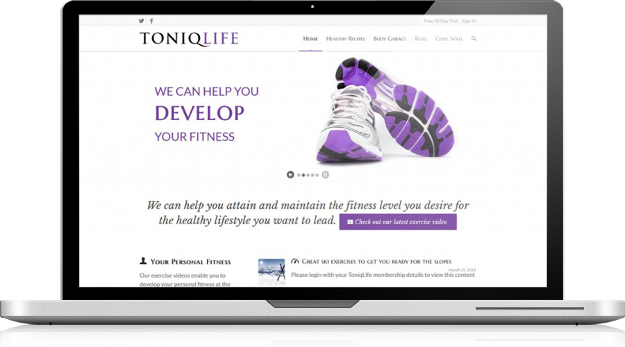
We designed and built an exclusive membership website replete with expert nutrition advice and high intensity fitness coaching videos.

It was a fantastic experience to be involved with the formative brand building and product development that comes at that stage.

The team came up with many great ideas and launching the site was as much about deciding what we couldn’t bring to the table at the first launch phase as designing what we could.

As of this post the website is going through a test phase with beta users and development is ongoing as part of year long road-map.

Energetic brand for community care site

Nearest Relative will be providing a valuable service to people requiring support.

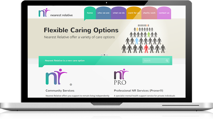
Not everyone has a relative on hand to help them in times of need – be they short term or long term care. Nearest relative aims to fill this gap. The overall visual identity needed to be friendly and accessible and the logo needed to place the brand squarely in the medical market. Logo and site created by Andy Gardner Web Design!

Locksmith website an open and shut case

AA Lock & Key came to me with a clear concept but no web design groundwork.

I did let Craig know that we had a full project load but he was convinced that we should be the ones to deliver his next site. Despite low availability we got out the elbow grease and 20 days later we launched the site together and it’s already converting customers, hooray!

Team adds local web designer Sam Tremaine

Happy to announce I will be creating collaborative works with Sam Tremaine a local web designer.

Starting next month Sam and I will be working on projects together alongside our individual website projects. Sam’s portfolio of local Bristol clients is really tight, fresh and professional, I especially love the responsiveness* of her sites! Looking forward to working together!

*Responsiveness is the developer buzzword for a site that copes well with the full spectrum of mobile, tablet and desktop devices – it’s responds well to the device it is shown on. It’s important as so much web traffic is mobile nowadays and you need to put your best foot forwards at all times!

Accessibility, what it does for your website

Accessibility is a broad concept but in the context of the web buzzword it’s about making your website inclusive for as many visitors as possible.

The web has a broad range of users such as those hard of sight or hearing and accessibility is perhaps a larger issue than most website owners assume. There are guidelines (known as WCAG) that standardise what is best practice in terms of accessibility and most businesses should be aiming for a double A standard (AA) according to those ratings.

As well as being beneficial for disabled users, many of the WCAG recommendations make your website more usable for everybody. It wasn’t long ago that many websites utilised tiny fonts and low contrast grey text on grey backgrounds making the web virtually unreadable for anyone who wasn’t 20-something with perfect vision. It’s since been shown that larger fonts make for an easier and  more relaxed experience for everybody. There are many other accessibility touches such as text tags for images and reducing the amount of text in images which have benefits for search engine optimisation. It’s certainly not something to be ignored!

Speed up your Website for fame and profit

Nobody likes a slow loading website but is it worth being overly concerned about?

Well hard research shows for every 1 second extra delay in page load speed can lose you around 7% of your potential conversions. Whether you’re selling a product or trying to get a new member to your organisation that hurts! Apart from the satisfaction of your users, page load speed is one of several hundred metrics Google has for judging your site worthy or not and a fast site is something you can get right with care and attention.

What needs to be changed? Well a good host is very important as cheap hosting will work but it won’t work as fast as a better spec’ed service. Once that’s right the focus is really on how you present your files. Optimising imagery in several ways helps. Files straight from your camera are a big no-no and some care should be taken to reduce image dimensions to only what is necessary and use compression before posting. Here using the excellent JPEGmini tool we see a image radically compressed but not suffer for it:

You can compress other content like the code the site is written with, but this is squarely in the remit of your web designer. Although there are other tricks of the trade, caching & compression are the backbone of a  fast site.

Responsive Web Design Helps Everyone

A new Bristol-based marketing agency founded and lead by elite professionals required a website that demonstrated their marketing savvy.

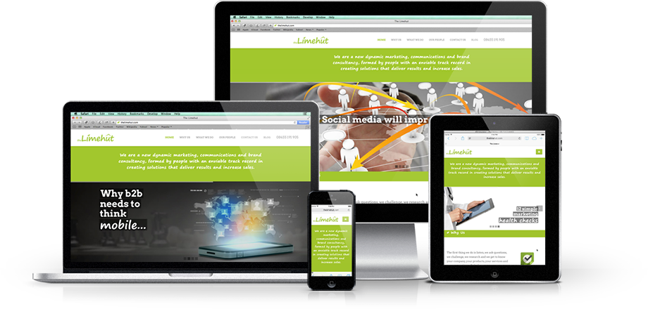
I was brought on to consult on the website that would demonstrate not only their pedigree but execute their concepts of best practice techniques. Responsive web design was a must as the well defined client profile included heavy expected iPhone and iPad usage.

One Page Websites get to the point

A one page site is an immediate proposition and one that isn’t necessarily short on content and design.

The website I created for award winning PR personality Pam Beddard is a one page design which flows efficiently from an introduction to a contact form. There is a traditional menu system at the top of the page for users that might be confused by something a little different – it’s always good to have belt and braces!

The site also lends itself to touch screen and mobile devices being extremely responsive.

Consistent Brand Across Different Websites

Blueprint approached me with a water safety website that needed rescue and a marine training site that needed a design refresh.

The two websites have different focuses and so I took two different approaches. They are both responsive websites (they work on mobiles well too!) with attention paid to Search Engine Optimisation (SEO), however,  because of their different focus they differ stylistically.

The training site is direct and simple with clear calls to action so users short on time can get straight to the content they need:

The safety site is similar as we need to remain on brand, but it establishes authority with safety conscious clients through being more reserved and verbose:

Branding Something a Little Offbeat

In an exotic, remote corner of south-east Asia a laboratory equipped dive resort required branding aimed at a western audience.

Now that’s a brief that includes some eclectic ideas for sure! The logo delivered draws on the shape made by the row of chalets on site, the tide they view and a hint of helix as a nod towards the scientific aspect of the business.

The font used is a lovely clear geometric sans called Avenir. It’s not purely geometric like Futura upon which it is based, so it it’s more easy on the eye; that O is not a perfect circle for example. The colours evoke the tide of crystal blue water seen on location but the logo works in monochrome too, an important consideration!

Growth from SEO for Bristol Community

Search Engine Optimisation (SEO) is a simple idea that covers a host of activities.

There are a lot of different actions an expert can take to improve your search ranking, but there is no silver bullet. In the unlikely circumstance a silver bullet was discovered, it would soon cease to exist as it would be antithetical to Google’s notion of page ranking and they would change their algorithm and thus your ranking gain. The takeaway – there is no quick fix for ranking.

On the right there are the Unique Visitors* to a typical client site of mine. With the SEO work put in (12 hours over 2 years) we see growth to 231% of their year one traffic – in absolute terms over 20,000 more people saw the site in year 3 compared to year 1.

In my opinion, rich content delivered in a well structured page is the way ahead. However, if you’ve spent any time Googling SEO services you will know people will offer you alternatives; back-linking services and all manner of subscription based voodoo that lacks any transparency.

I’d recommend avoiding any such shenanigans as even if you did see some short term gain; Google is always iterating and improving how they rank sites and they’ve made it pretty clear they don’t approve of these practices and are quite happy to blacklist your site.

*Unique Visitors is a standard metric. This measures individuals rather than ‘hits’ where website visitors are measured more than once.

Growth of Mobile in Bristol Community

Smartphones are everywhere, Jim Kirk eat your heart out.

So yes, it seems unlikely anybody out there is unaware of the phenomenal growth in mobile ownership, or the fact that these devices get fancier by the month.

What you might not be aware of is the resulting radical change in the usage of the web. Here’s some amalgamated stats from some of the community sites I manage.

These aren’t tech focused sites at all, nor are they aimed at a young audience. So we’re not seeing a skewed perspective here – these are typical Bristolian users with mobiles and tablets going from less than 3% of the audience to 22% in two years flat.

The take-away: if you’re thinking of building a website soon, it needs to be responsive.

JahShaka Surf Magazine Website Launched

JahShaka Surf needed a website which not only delivered their service portfolio but successfully engages the surfer community they’re building in Lagos.

This is a responsive site that allows the JSS team to make news posts, embed images and videos and change the copy on their services.

Customers are engaged with rich content: reviews of surf products, technique guides and videos. Social media is also leveraged; customers can give feedback with Facebook guestbook and JSS’s twitter feed is updated live across the site.

An easy to use booking form streamlines handling each lead generated by the site.

Updating Rather than Replacing Branding

A Bristol IT Support company approached me to redevelop their website as they felt it didn’t reflect their cutting edge services.

These chaps are some of the best around when it comes to IT Support; designing networks, cabling, servers, but even with their tech savvy they wanted to bring someone on board for design.

One issue was their logo was a little dating… Developed in house and with a 25 year history we didn’t want to lose that identity completely; just bring it up to date and give it a little polish. This has a bit more emphasis on the brand name and loses some of the fiddly details that meant the logo didn’t scale well. You’ll find the relevant site in my portfolio.

Events Calendar for Bristol Community

The project involved rescuing a website that had been compromised but it provided the opportunity to build a much needed robust events system.

This community minded group needed an events calendar that could have multiple contributors, intuitive administration, be styled to match their brand and automatically add events to calendar views, their events page and their homepage when created.

We installed and configured an off the shelf utility that uses Google Calendar and integrates well with WordPress; their chosen Content Management System (CMS). This was then slightly customised to meet the groups needs; resulting in a very cost-effective solution.

New UBMO Website Sets Sail!

The web design refresh of specialist suppliers UBMO went live last week; we’ve kept their striking branding but completely overhauled the website.

The site needed to reflect their forty year history and global reach, which was achieved in copy revision as well as bespoke graphics. With many services on offer the website need to clearly break them down and show case studies in a portfolio format. Getting in touch is made simple with a very straightforward and reliable contact form.

Based in Clevedon but with a global reach UBMO have a forty year track record in delivering construction materials. Their team procures all manner of construction goods and solves all the problems necessary to deliver them to all corners of the planet.

Putting Business Character into a Design

Straight talking b2b chaps over at this local wine firm had been established some time but needed to revisit their branding as it didn’t really represent the firm well.

Wine is an industry where people have been successful talking about peppery notes in plummy voices, but SWW are more plain-spoken and focused on good business relationships and competitive prices.

The logo is designed to reflect SWW’s business focus, now it isn’t without a touch of class, but it doesn’t try to be something it’s not; just like SWW.